In Part 1, we configured our Shopify store and Data destination in the Integrate.io dashboard. We also mentioned the parts of Shopify Admin API, which are most commonly used. Now it's time to set up a pipeline to fetch that data from our Shopify store and load it into the configured Data Destination.
Creating the Shopify Pipeline
First, we need to create a package using the Create Package menu option on the dashboard.
A Quick Way to Get Started
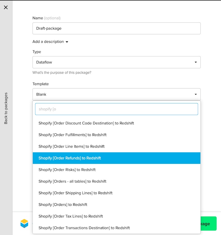
Integrate.io has existing package templates for pulling the data from different Shopify APIs (Orders, Products, Customers, and more) to Redshift. We can use them to bootstrap our package pipeline and make changes as per our needs.
To begin, select the "Shopify [Order Refunds] to Redshift" template.
Once you create a package, you will see a dataflow graph like this:
Template Pipeline Overview and Modifications
Let's try to make sense out of the pipeline and make changes according to our needs.
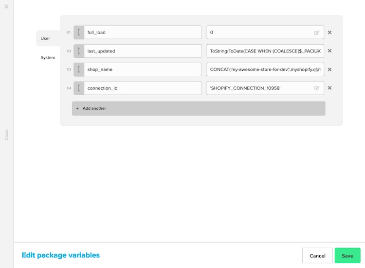
Setting the Variables
Enter the shop name and the connection ID. This information can be found from the connection we created previously.
Now edit the REST API component to add our Shopify connection in the authentication.
The "Shopify API [Order Refunds] to Redshift" template package builds out the pipeline to create a database table of Order Refunds in Redshift. But as mentioned in the Part 1, we're also interested in top-level Orders and similar information from Products and Customers resources.
Integrate.io offers a separate template for the top-level Order fields named "Shopify API[Orders] to RedShift" that contains a very simple pipeline:
We can either use this template package independently and configure variables (like we did with the Order Refunds pipeline), or we can use this package pipeline as a reference to create a similar flow in the existing pipeline. If you have multiple tables to create, the latter option is better. Since we are planning to load data into multiple tables, I've added the flow for top-level order fields in the existing package:
Having a look at the pipeline, you'll notice that we've used 4 types of Integrate.io components:
- REST API source component: This component is used to fetch data from the Shopify using their admin API.
- Clone transformation: This component is used to apply different operations on the same data.
- Select transformation: This component is used to select, create, or filter fields in the data.
- Redshift destination component: This component is used to write the selected data to Redshift.
If it looks a bit too magical, don't worry. It will be explained when we add the flows for the other two (Products and Customers) resources.
For reference, the ultimate pipeline after adding flows for all three resources will look something like this:
To reach the above state, we must complete two tasks:
- Add Customers and Product API paths to the pipeline.
- Replace the Redshift destination components with the custom ones.
Let's walk through these steps one by one. It is important to understand what each component does so that we won't have to solely rely on the template package for our pipeline.
Adding Customers and Products Endpoints to the Pipeline
The process is similar for both the resources
1) Copy the existing REST API component for Orders.
2) Modify the component details, i.e. change Resource in the URL to products.json, change the base record JSONPath expression to $.products[*] (implying select all the objects under the products field array in the response)
In the third step, Integrate.io will automatically detect differences in the schemas (between Product and Order) and apply them once you click the prompt.
3) Add a clone component.
4) Underneath the clone, we add two select components (named product_fieldsand flatten_product_variants) in parallel. First, one would select the high-level products field (like product-id, title, tags), the second one would choose the nested product variants in the variants field of the response.
5) In the product_fields select component, we select the top-level fields of interest and rename them with custom alias values.
6) Since the variants field consists of an array, we'll have to apply the [Flatten](https://www.integrate.io/docs/flatten/) function first to be able to access array objects one by one, and then we'll convert these objects to map using the [JsonStringToMap](https://www.integrate.io/docs/jsonstringtomap/) method.
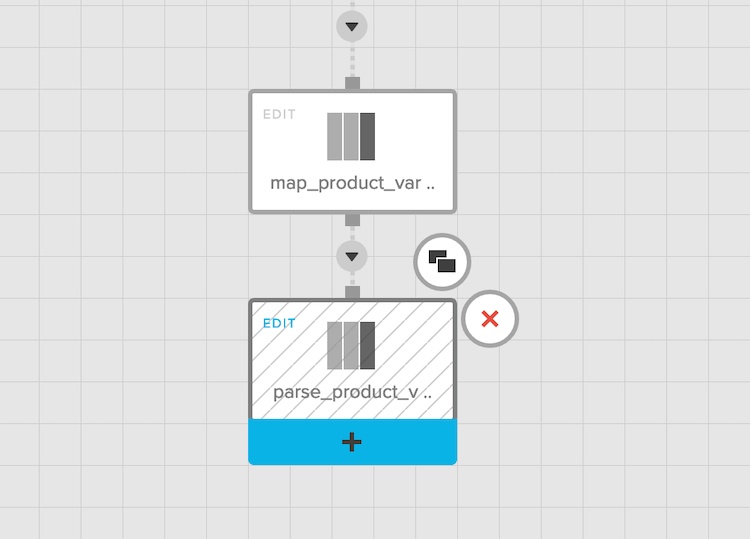
7) Finally, we select the variant fields in a new select component called parse_product_variants. Notice how we've used type-casting and # character in (long)variant#id to access the id field inside the variant and convert it to long integer (originally a string).
The graph now looks something like this:
Similar steps are performed for Customer resource (the product variants array here is similar to customer addresses array in Customer resource). We are now left with the last step left in finishing the pipeline.
Adding Data Destinations
If you want to maintain the data in Redshift, you can use the same Redshift components that came with the template we used and add a Redshift connection. If you have a different data destination, we can simply replace those Redshift components and add our own database destination components. To add the database destination, follow these steps:
1) Click on the plus icon of the last select component. Select the appropriate destination component in the next screen.
2) Edit the generated database component:
- Specify the target database connection (the one created previously), and a target table name.
- In the operation type, select "Merge with existing data using update and insert" if you want your pipeline to incrementally push the data to your database.
3) In the schema mapping step, click on Auto-fill to populate the fields automatically. Specify unique identifiers (primary key) for table rows.
4) Repeat steps 1-3 for other tables in the pipeline.
Your package is ready!
Testing the Pipeline
Before testing the package, we recommend complete the following final checklist:
- Click on Save and Validate to check for errors. If there are none, a green signal appears.
- Click the yellow "Run Job" button. If you don't have any clusters, create a sandbox cluster, and choose it. Verify the values of the Variables and click Run job.
- You can monitor the progress of the job in the dashboard. The first run of the job failed because of bad database connection settings.
- Once it's green and 100%, we can verify the data in the database destination specified in our package. Optionally, if all is good, we can create a major version of the package.
Visualizing the Data
When it comes to visualizing data, there are many options available to you. For the purpose of this post, we will use Google Data Studio. It's a useful, no-code tool and versatile enough to answer most of the common queries using visualizations.
Let's walk through how to connect our data to Google Data Studio.
1) Go to the Google Studio home page and create a new dashboard. It will prompt for a data resource. Provide the destination database details, which we used in our Integrate.io pipeline to store the data. In this example, we have added a PostgreSQL database and selected the shopify_orders for now.
2) Verify the metadata about the fields. Data Studio is quite good at detecting the data types of the fields, but it might fail to do so properly in some cases. So in the Data Studio, go to Resource> Managed Added Data Resources > Edit and then verify the data types.
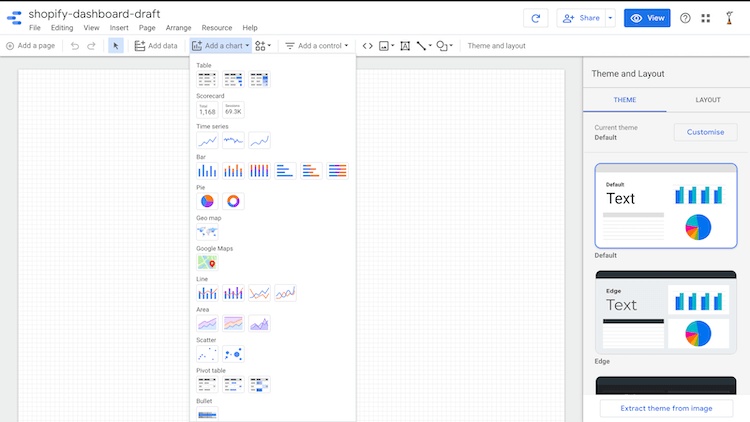
You can now begin creating your visualizations. Here are the types of charts that Google Data Studio supports:
Instead of covering all these options, we'll start with a question we want to answer, and then create the visualizations accordingly.
Q: How many orders have been placed?
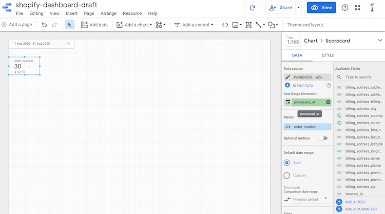
For this, we can use the following scorecard type chart:
All the configuration happens on the box at the right. There are a couple of important concepts to keep in mind here:
-
Metric: The value that is going to be visualized. In this case,
order_numberis the metric. - Aggregation type: Since the output of a scorecard is just one value, we need to somehow aggregate all the values. We've selected the aggregation type as CTD (Count Distinct) since we wanted to know the total count of orders.
Q: How many orders have been placed this particular month? And how has the number changed as compared to the last month?
For such questions, we can use additional controls. Let's add a Date range control to our dashboard. We'll set the default date range to "This month."
The scorecard still shows the same number. To update the count, we need to specify the "Date range Dimension" based on which Data Studio will decide the Date of an order. In our case, that information is present in the processed_at field (notice that Data Studio has also detected it's field type as Date). To show the change as compared to the last month, we've also specified the "Comparison date range" value as Previous period:
Q: What are my total sales, discounts given, and taxes? And how much they've changed from last month?
These values can be calculated just like the order counts from the fields total_price, total_discounts, and total_taxes respectively. We'll apply the sum aggregation and specify the currency type as USD-US Dollar.
In the styling options, we've marked "Compact Numbers" and "Show absolute Change" options to True to fit our preferences.
Q: How have been by sales growth throughout the year?
For this, we'll plot a Time-series chart, specify the metric as total_price aggregated by sum, dimension as processed_at, and set the "Granularity" level to month.
Q: Do my orders vary based on the day of the week?
For this, we'll plot another time series with bar-style (since the line plot doesn't make much sense here), aggregate order_number by distinct counts, and set the granularity to "Day of the week" level.
Q: What percentage of my orders are refunded?
For this, we'll plot a Pie chart and specify the "Dimension" as financial_status. As per Shopify API, financial status can have 3 values; "paid", "refund" and "pending". The pie chart will present their proportion.
Q: Where are my orders coming from?
For this, we'll use a geo-map chart. The chart's dimension can be either shipping_address_country_code or shipping_address_country since both of these fields are detected as locations by Data Studio. It is also possible to zoom on a particular city and pin more specific locations (see the docs). We've added a pie chart adjacent to our map to serve as a legend. It uses the same dimension as of geo-map chart.
Q: How many new customers do I have this month? How many of my transactions are pending? How many unfulfilled orders do I have currently?
These questions can be covered by scoreboard charts. A newer concept we have to use to answer such questions is filtering. I've created a Filter called first_order that includes only the rows with the customer_order_counts field value set to 1.
Similar filters can be created to get pending transactions (include only the rows where financial_status equals 'pending') and unfulfilled orders (exclude the rows where fulfillment_status equals fulfilled).
Q: How do I see all the above metrics for a specific country? How can I see metrics associated with refunded orders?
For this, we'll add two Data control widgets, one with the control field shipping_address_country, and the other one with the control field financial_status.
Q: How do I make my dashboard look good, and share it with my team?
Data Studio has lots of styling features. I have added some text and rectangular boxes, aligned the scorecards, and changed the theme. There's also a convenient option to extract the theme color from the image (your website screenshot or logo):
Finally, you can share the report using a URL, just like how you'd share a Google docs file, and see an interactive report built from your Shopify data. You can also embed these reports on your website.
You can visualize other tables (Customers and Products schema) in the same way.
Keeping the Data in Sync
To complete your solution, we recommend adding the scheduled sync functionality. Integrate.io provides the capability to run our packages based on a recurring logic. To do that, simply create a schedule from the Integrate.io dashboard and specify the frequency and package to run.
In Integrate.io
Creating a schedule will make sure the data is updated frequently. Integrate.io will only fetch the data incrementally from Shopify.
In Google Data Studio
In Data Studio, navigate to Resource> Manage added data sources > Edit resource and then update the Data freshness. If you set it to 1 hour, Data Studio will check every hour for any database update the charts accordingly. If you need to refresh data on the fly, you can do so using the Refresh arrow next to the Share button at the top of the window.
Conclusion
In this post, we have complete the following tasks:
- Set up a system to analyze Shopify store data visually.
- Configured Shopify and Data connections in Integrate.io just once.
- Used Schedules to load data incrementally (only the changes from the last fetched data) via the pipeline that we created using various Integrate.io components.
- Answered a number of day-to-day analytical queries with help of the Google Data Studio a visualization tool
There's definitely a lot more we can do with Integrate.io and Google Data Studio, but let's keep that for another post!
Possible Next Steps
- Try out Community visualizations in Google Data studio; there are lots of them. (Note: be careful if your data is sensitive as most of those apps store your data at their own servers).
- Blend data; How about combining Products, Customers, and Orders in a single table? You can do blending in Google Studio to do that. You can also join the data in Integrate.io pipeline using Join Transformation if the space inefficiency due to storage denormalized tables is not an issue for you
- Sprinkle some code; You can use the extracted data and use Machine learning and statistics to gather insights, make predictions, and detect anomalies.
