We live in the age of Big Data, continuously fed by sensors, devices, video/audio, networks, log files, transactional applications, web, and social media — much of it generated in real-time and at an immense scale.
The technologies surrounding Big Data collection analyze the data created by these processes around the clock. The quantitative foundation of Big Data is its greatest strength, but also its Achilles heel. The current methods make it challenging to derive concrete blueprints or actionable insights in the context of dynamic business decisions. In other words, data-driven decision-making is still mostly left in the hands of those at the top of the corporate ladder.
Hence, the current trend is moving towards 'humanizing data,' meaning there is a push to process information so that non-technical members can derive clear and actionable insights from Big Data analyses and use them as a basis for decision making. Humanizing data requires an approach that is more qualitative than quantitative, and relies more on data visualization and storytelling than the traditional approach.
Humanized data results in more inclusivity and transparency. When data is easily accessible, intuitive, and transparent, decision making becomes more democratic, and the business thrives. Instead of relying on specialized programming and statistics skills, a humanized approach utilizes straightforward tools and processes, resulting in unfiltered interpretations of the given objective. After all, data starts with humans. Doesn't it make sense to include more human involvement in the processing and interpretation of that data?
In this article, we distill the techniques and thought processes of those at the bleeding edge of humanized data, providing a cheat sheet to get you started on this journey.
- Telling Human Stories with Big Data
- The Role of Visualization in Humanizing Data
- A Historical Example of Data Humanization
- Humanizing Big Data with Integrate.io
Telling Human Stories with Big Data
Data storytelling is emerging as a critical skill set for data analysts to develop productive relationships with the decision-makers who must understand analytics and its implications. Otherwise, they will not alter their behavior or adopt an analytical approach.
Data visualization can reveal stories within data. However, these "data stories" differ in important ways from traditional forms of storytelling. More and often storytellers, especially those versed in new media, integrate visualizations into their narratives. In some cases, they even allow the visualization to function in place of a written story. Brent Dykes, an author and consultant in the realm of data strategy, captures the collective mood: "People hear statistics, but they feel stories."
Daniel Waisberg, an Analytics Advocate at Google, wrote the following in a Think With Google paper:
"We know that data is powerful. But with a good story, it's unforgettable. Executives and managers get bombarded with dashboards brimming with analytics. They struggle with data-driven decision making because they don't know the story behind the data."
Storytelling allows the viewer to derive insight from the data. Information visualization is essentially transforming data and knowledge into a palatable representation that helps the human visual system perceive the embedded information within, thus enabling the viewer to understand and conceptualize the data intuitively.
Miro Kazakoff, an MIT Sloan lecturer who teaches Communications & Data Storytelling emphasizes the importance of data storytelling in unlocking the value of analytics:
"If you want people to make the right decisions with data, you have to get in their head in a way they understand. Throughout human history, the way to do that has been with stories".
In the book Made to Stick: Why Some Ideas Survive and Others Die, co-writer and Stanford Graduate School of Business professor Chip Heath describes an exercise he carries out each year with his students. The students must give a one-minute speech on a topical issue, and the class ranks all speeches at the end. The immediate fallout results in the most confident speakers winning. After presumably closing the matter and moving on, Chip returns to the topic later in class and asks his students to recall the speeches. 63% of the students remember the speeches that told a story, while only 5% remembered the statistics.
"This is the role stories play," Chip writes, along with his co-writer and brother Dan. "Putting knowledge into a framework that is more lifelike, more true to our day-to-day existence. Being the audience for a story isn't so passive, after all. Inside, we're getting ready to act."
The Role of Visualization in Humanizing Data
It's easy to place value when judging a graphic display on appearance alone – pretty colors, fancy charts, cool pictures – but if the visualization doesn't give quick insights that aid decision making, it's not practical. Identifying and removing chart clutter reduces visual "noise," allowing the audience to focus on the information.
In his seminal book, "The Visual Display of Quantitative Information," Edward Tufte formulated the concept of "Chart Junk," describing such noise as "elements in charts that are not necessary to comprehend the data represented in the graph." He goes on to Tufte lay out principles of excellence and integrity for data visualization.
The following list is a summary, known as an insider secret within the data viz community.
- Show the data
- Induce the viewer to think about the substance, rather than about methodology, graphic design, the technology of visual productions, or something else.
- Avoid distorting what the data has to say
- Present many numbers in a small space
- Make broad data sets coherent.
- Encourage the eye to compare different pieces of data.
- Reveal the data at several levels of detail
- Serve a reasonably clear purpose: description, exploration, tabulation, or decoration.
- Be closely integrated with the statistical and verbal descriptions of a data set.
And he concludes with the following Principles of Graphical Excellence.
- Graphical excellence is the well-designed presentation of interesting data—a matter of substance, of statistics, and design.
- Graphical excellence consists of complex ideas communicated with clarity, precision, and efficiency.
- Graphical excellence gives the viewer the most significant number of ideas in the shortest time with the least ink in the smallest space.
- Graphical excellence is nearly always multivariate. And graphic excellence requires telling the truth.
- Excellence in statistical graphics consists of complex ideas communicated with clarity, precision, and efficiency.
From Edward Tufte, Visual Display of Quantitative Information, page 92.
Related Reading: What is Data Visualization?
A Historical Example of Data Humanization
Florence Nightingale is renowned for her accomplishments in professionalizing nursing roles during the Victorian Era and establishing a nursing school at St Thomas’ Hospital in London. A tradition continues to this day where new nurses take the Nightingale Pledge at their pinning ceremonies, and the Florence Nightingale Medal is awarded internationally to nurses of the highest distinction.
In 1854, Nightingale arrived in Turkey and organized care for soldiers during the Crimean war as well as advocating sanitary conditions in battlefield hospitals. While caring for her patients, she kept detailed data on causes of death and survival rates, eventually using it to create charts and infographics to effectively communicate medical information.
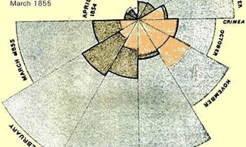
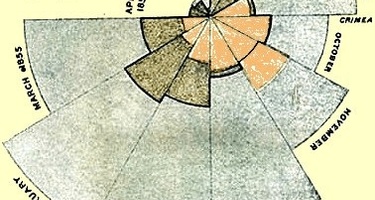
One of her best-known visualizations illustrates that far more soldiers were dying from preventable contagious diseases than battle wounds. She visualized this data in what was later called a Coxcomb Plot. Her visualizations showed a direct correlation between the lack of sanitation and the soldiers' low survival rates.
Nightingale's graph cuts into twelve equal angles, with the slices rotating in a clockwise direction, showing what's happening in the different months of the year. The outer reach of each piece shows how many deaths occurred in that month. We see little short slices in April, May, and June of 1854. After the troops land in the Crimea, the portions begin reaching far outward in the radial direction.
She needed to convince the British parliament and Queen Victoria to invest in sanitary infrastructure. To achieve this, she presented the data in the most coherent manner possible. She showed the “Diagram of the causes of mortality in the army in the East,” which consisted of a new polar area chart, a variation of the pie chart. The visualization shows death by month, color-coded by cause of death. In her own words, “to affect thro’ the Eyes what we fail to convey to the public through their word-proof ears.”. The method of data storytelling was incredibly impactful, and sanitary infrastructure upgrades took place, saving countless lives.
Humanizing Big Data with Integrate.io
How you can follow Nightingale's lead and generate actionable insights? More importantly, how can you gather the data you need as quickly as possible, without draining engineering resources or resorting to hand-written notes?
That's where we come in. Integrate.io's ETL platform provides a simple, visualized data pipeline to ensure that businesses can quickly process their data for faster analysis without investing in any additional software or hardware. From simple data replication to elaborate data preparation and transformation jobs, Integrate.io covers all use cases with a point-and-click, drag-and-drop interface. To find out how Integrate.io can help you tell your data story, schedule a call to arrange for a demo, a seven-day pilot, and a complimentary session with our implementation team.


