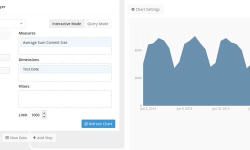
We concentrate on making the data processing as fast and easy as possible for our users. To complete the dataflow, Integrate.io integrates with a plethora of services that can store, analyze, or visualize data. One of these services is Chart.io, a popular service for data visualization. You can use Integrate.io to process the data and then visualize the results in Chart.io. Here’s how.
Processing Data with Integrate.io
In the example below, we used Integrate.io to process public GitHub data and find the total commit sizes per day in June 2014.
Dataflow
-
github_source — loads the relevant GitHub data from our public S3 directory
-
filter_commits — filters only PushEvents (commits)
-
select_fields — selects the commit size field while typecasting it to an integer and changes the date to a string format via the
ToString(created_at,'yyyy-MM-dd')function -
sumcommitsize — calculates the total commit size per day
-
output_redshift — saves the results to Redshift so they can be loaded in Chart.io (here’s how to connect Integrate.io to Redshift). Integrate.io can also save the results as CSV files or to relational databases, which can all be integrated with Chart.io.
Visualizing Results with Chart.io
Once the above job is executed on a cluster, the results will be stored in Redshift. To load this data in Chart.io:
-
Log in to your Chart.io account
-
Go to “Settings” and “Data Sources” to connect a new data source and select “Amazon Redshift.”
-
Enter all the relevant Redshift connection details and click “Connect.”
-
Start visualizing your data.
Summary
Data can be easily processed with Integrate.io and then visualized in Chart.io following the above steps. We showed an example of how GitHub data can be aggregated and visualized, but we’re really curious to see what you would be able to do with your data.


